The 1970s were a very interesting time for wristwatches. Not only were the post-60s styles making an impact on dial, case and strap design, movement technology was about to create a crisis.
The ‘Quartz Crisis’ of the 70s and 80s put a huge fear into watchmakers and not without some solid grounding. As opposed to a mechanical watch that relied either on manual hand-winding or automatic self-winding, quartz movements only required a little battery that could power the watch for years. It levelled the retail playing field as manufacturing costs were much less to produce a quartz watch than a Swiss-made mechanical watch. This allowed many brand new watchmakers to set up shop not only in North America but especially in Asia. By 1978, more watches were being exported from Hong Kong than any other country on the planet. Sadly, the booming sales of quartz watches forced many Swiss and American mechanical watchmakers to either sell their brand names to larger manufacturers or simply close down forever, vanishing generations of horological craftspeople almost overnight.
But this history lesson has nothing to do with the watch I am reviewing today. It’s merely a mention of the times that have influenced the look of this watch. So, let’s rewind back to before quartz changed horology forever.
In my search for microbrands, it’s easy to get lost in a sea of Rolex Submariner homage watches. I get it, they’re not only beautiful watches, but they’re also what sell. But one microbrand that really stood out to me as committed to not releasing your run-of-the-mill diver is Gane Watches. Started by Singapore-based engineer and watch devotee, Raymond Pee, Gane Watches emerged from the pandemic as the founder decided to live out his dream. After a crash course in how to launch a watch brand and the myriad details involved, Pee released his Type C watch. A mix of influences, the tonneau shape combined with a sundial-style face, sets the Type C apart from many others.
First, a bit of learnin’.
Tonneau translates from French to English as ‘barrel’. As the shape tapers at the top and bottom, while the middle is rounded, it’s a well-named style. First created and named by Cartier in 1906, the shape is most commonly associated with dress watches. Most recently tonneau styles are dominated by the sky high-priced and magnificently bizarre Richard Mille watches.
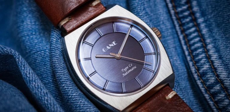
Gane sent me their brushed Blue Type-C2 for this review.
Starting with the layered, two-plate dial, its textured brushed steel gives the watch a charming look with a blue that shifts from pale grey-blue in direct light to violet indigo.
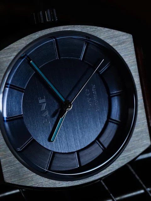
The chapter ring, the marked portion of the dial containing numerals or indices, on the Type C is blank, but not unmarked. Instead of typical marks, the hours are denoted by debossed lines in a sundial formation. The simplicity of the dial continues with the stick hour and minute hands that hold an almost-too-thin fill of C1 Super-LumiNova.
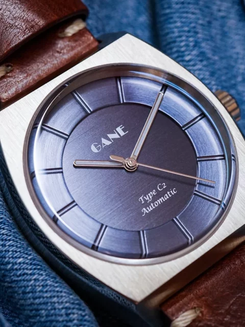
The final comment on the dial is not a positive one and is one I have not only read in other reviews but also have heard personally while wearing the watch. The Gane logo uses an Art Deco typeface that in my opinion better serves a deli than a watch brand. In addition, the only other print on the dial is the model, Type C2 Automatic which is set in a Chancery script. As a lover of type and as a graphic designer, I would call these choices unfortunate and could quickly find very suitable substitutes, even within the Art Deco genre. Sadly, the type choices seem to detract from the overall appearance of the Gane Type C, which is really too bad.
This allows me to point out a very specific detail about my tastes in watches. Typefaces hold a very particular space for me as I work with them in my day job. I can’t not see typographic wonders as well as disasters out in the world. Any headline I see generally reveals fixes that I would solve had I worked on them. This leads me to a discerning choice in watches based not only on the typeface used but also the look, size and scale of any element of the dial. There are huge brands as well as microbrands that I simply wouldn’t wear for this reason. I know it’s closed-minded or nitpicky, but it’s impossible for me to turn off. I will say that despite my opinions on the typefaces used on Gane watches, it wouldn’t prevent me from wearing the watch as I think the positives of the aesthetics overshadow these details.
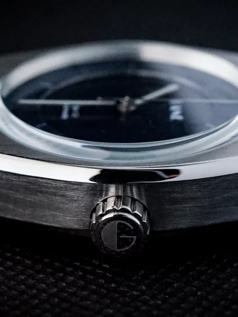
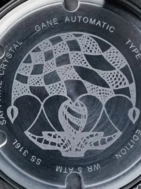
Regarding the case, the size is a tasteful 38mm that works very well on my seven-inch wrist. The case thickness measures 13mm, while the lug to lug distance is 45mm. Worn on my teenage son’s 6.25″ wrist, this size looks a bit awkward, so I would likely recommend this watch for larger wrists. I love the size of the 6.5mm gear-toothed crown as it compliments the size of the 316L surgical grade stainless steel case. Above the dial is a raised sapphire crystal with an underside anti-reflective coating. The caseback is closed and features an etching honouring Raymond Pee’s mother.
Under the dial is a 21 jewel Miyota Caliber 8215 that claims a 42-hour power reserve. While it is non-hacking (meaning when the crown is pulled out to adjustment mode, the second hand remains in motion), it can be hand wound in addition to autowinding. The 8215 is a fairly standard automatic movement found in many microbrand watches.
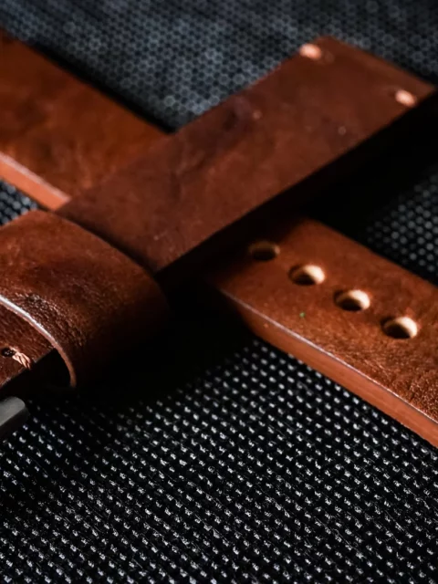
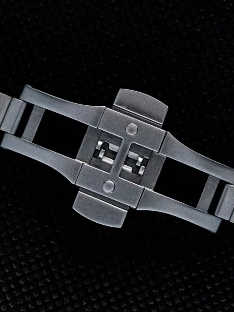
Lastly, perhaps my favourite parts of this watch are the straps. Common to each Type C watch is a 20mm width, 4mm thick deep brown Italian leather strap with a 316L steel buckle. I LOVE this strap and have complimented other watches in my collection with it. It has a weathered look that adds to the C2‘s vintage appearance. In addition, I was sent Gane’s 316L five-link bracelet. It has a butterfly clasp and straddles the line of rugged casual and vintage dress. Unlike other strap pairings I have been sent, these two really change the character of the watch and can complement different styles of outfits. The C2 looks entirely different with the bracelet.
My overall opinion of the Gane C2 Automatic is quite positive, despite my opposition to the typefaces used on the dial. I congratulate Raymond Pee for successfully designing a watch that stays true to his own tastes and doesn’t try to glom onto an existing trend or homage watch. It takes a lot of guts to risk creating something new within a field of successful copycats. Even if it looks into the past for its overall design.
The Gane Type C Automatic watch comes in Steely Silver and Sandy Salmon dial colours in addition to the Brushed Blue. Strap styles include black, deep brown and tan leather and stainless steel bracelet. The Type C is priced at between $495 and $555 depending on strap choice and includes worldwide shipping.

Aron Harris
Latest posts by Aron Harris (see all)
- Royals Tour: Queens of the Stone Age Cross Canada - April 13, 2024
- Eagles Say A Long Goodbye To Toronto - March 15, 2024
- GRAMS28 – Luxurious Transport for your EDC - March 11, 2024